I’ve known of some problems with one of my WordPress themes for a while but pushed it aside.
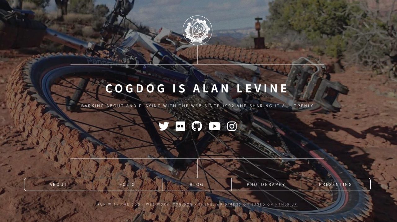
WP-Dimension is one of my favorite “Calling Card” WordPress themes. maybe if it was the first one I welded from the HTML5Up original template. A lot of folks use it (including mine at the Best Domain I Could Ever Get).
So what’s the problem?
It’s those front page boxes.
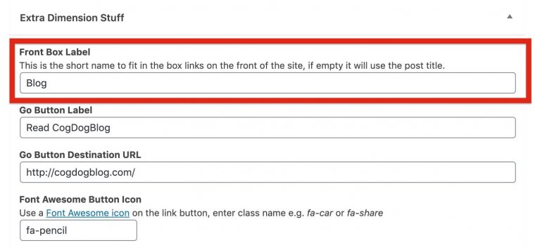
In the original and on my site, they work great because the labels are all short and about the same length. In the theme each “box” is generated by a separate post for content. I made it so you could have a long title that appears when the box is opened, but an editing option let’s you define a shorter “label” for what is shown on the front.
For the content in my middle box, the title is “A Cog, a Dog, a Blog” but the label “Blog” is defined in a set of extra editing fields:
But I have seen cases, even in my own use, where longer titles don’t fit well, and worse, when you test the responsiveness by squeezing the browser page width, the text falls out of the boxes. Very ugly.
“One day I should fix this…”
I was inspired this week when reading Brenda Gray’s tweet about using the theme for a TRU site:
But, as she found, like I had seen (and brushed aside):
That is how I usually dealt with it- tweaking the labels until it looked better. I did some quick experiments trying to set some breakpoints to use different styles, but it was still awkward.
I did not really like that. It was a cheap solution and not flexible. So last night I looked up some hints for CSS responsive menu boxes finding Dan Rose’s Responsive, Fluid-Width, Variable-Item Navigation with CSS. I thought it was worth a try and started playing with the suggestions for using table-based CSS.
No, not old school HTML table layout (more or lesss the 1990s of web design), but
Fear not, I am not advocating the use of a 90s throwback HTML table for layout; that would be semantically incorrect, of course. However, there are display values that allow elements to act like a table.
https://www.sitepoint.com/responsive-fluid-width-variable-item-navigation-css/
I fiddled first by putting Dan’s suggestions into the browser inspector (how I do most of my web design fiddling). It worked. Really. Well.
I ended up doing some more things to do away with the hover color based on the link, and instead the whole box (a list item element, you can add :hover effects to anything!). A bit of vertical-align got the labels centered in the boxes, and even some tricky first-child last-child selectors let me round the corners of the end boxes.
It looked great everywhere except the mobile view, where it was too cramped. So I left that to the default way the HTML5up theme designed it, stacked vertically by making me new CSS only for screen sizes bigger than 480pxm wrapping inside media selector of @media screen and (min-width: 481px).
My own tests seem solid, see it on a mixed label size demo at http://lab.cogdogblog.com/dimension/ Give the window some squeezes and stretches to see if it behaves well.
You can try it now by installing or updating your WP-Dimension theme from the updated version at https://github.com/cogdog/wp-dimension.
I’m looking for feedback, then I can let the Reclaim Hosting folks put into motion the magic elves that automatically update sites that uses their cpanel one-click installer of the theme (as if you need another reason to host your sites there!).
Prettier boxes are here.
Featured Image:
