Another problem with taking the quick short cut route of doing ds106 assignments is generally the text tools are limited to slapping text on top of photos. I am seeing a number of the early work my students are doing is that are not really looking at how the text interacts with their design.
If the text is just typed over the picture, it will look flat, often it is not as readable due to conflict with the background, and frankly, it ends up looking not designed.
I’m beginning to wonder if when asked to designa poster, if students are really thinking about say, how movie posters look?
Let’s say i am working on some assignment, maybe it is designing a book or album cover, and I use a photo of my friend Bryan Alexander. I can use many tools, but I choose pixlr a free web based editor I see a numnber of students are using — and woah, I am impressed, it has layering tools and thus can do many things I want students to be doing in their graphics.
But if all I do is toss some text on top of Bryan, it looks cheap:

There are all kinds of problems, it clashes with the background, the color is not really working well with the color in the images. it looks like it is slapped on. This is not designed.
What can we do?
Text ought to stand out. This image has a lot of dark colors, so I can create contrast by using light or white text and position it over dark parts of the image or at least not over his face. If I stack the words instead of letting them run across, I can make the text bigger. Yo generally want big fat bold text in your images, not skinny little letters.
This feels not only better, but more interesting, eh?

Or try this, use the settings to reduce the opacity of the text layer, so you can see partly through it. Here I slide it up, and try to create some interest by putting the “A” under Bryan’s eye:

There are a lot of things you can do with text. Photo editors like PhotoShop,GIMP, even pixlr, ahve editing effects like drop shadows. You can use things to trace or stroke the shapes. You can make them bulge out like 3D. You need to explore the capabilities.
But as you look around this week like we did for the design blits, when you see advertisements or print materials, pay attention to the placement of text and how it interacts with the background. You will almost ever see simple flat text just haphazardly pasted on top of a photo.
Let’s look at another example and an approach to explore- it is as simple as putting a layer behind your text to make it float above the image.
One of my students, Grace did her assignment to create a poster for a radio show. I loved what she did with the image, but commented that the text does not work at all to make a cohesive poster- it looks pasted on top:

Like my example, the text here conflicts with the background (the way the black letters overlap a dark part of the car), the colors do not even blend or contrast well with the photo.
I asked Grace if she would send me the original photo so I could walk through some possible ways to make the text work better. Keep in mind, there are many things one can do here, my design here is not the definitive best, but I hope she can see that by using a graphic editor with layers that she can make it more of a better designed poster.
I did this work in GIMP which, despite its interface quirks, is so worth getting to know how to use if you do not have access to PhotoShop. The price is right, $0.00.
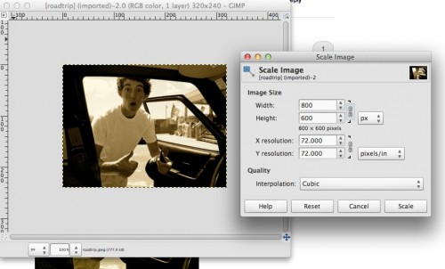
The first problem is the source image is too small. You really want to work on your images at or greater then the size you ultimately want to produce- so try to find source images at least 1000 pixels wide.
So I used the scale tool to yank it up to 800×600 (this is not the best way to go since the picture quality degrades, try to get a bigger source image to work with):
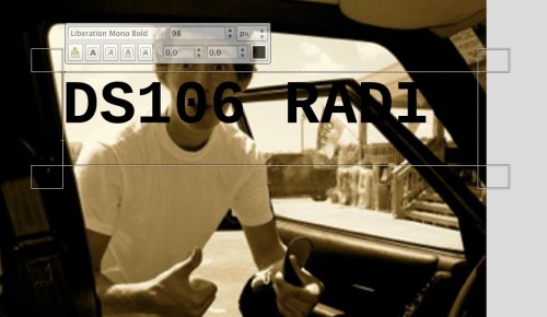
So next I might put in my text; GIMP has a basic starter set (I guess you need to do something to add fonts), but we cna go with a thicker san serif, and of course black alone wont help:
Now what we want to do is to create a layer we can put behind the text.

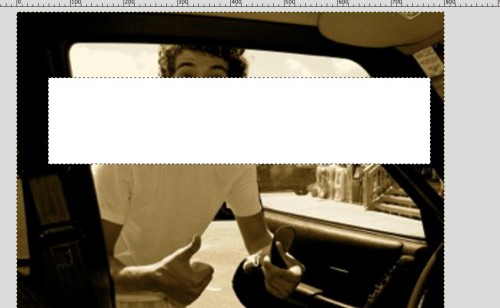
I select a postion of this image and then fill it (bucket tool) with white. It of course looks wrong for now:
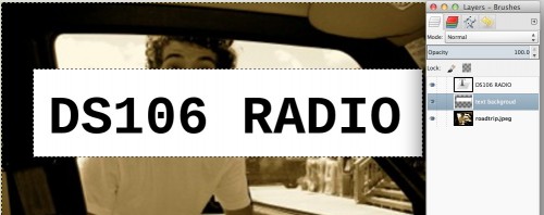
This is where thinking about layers comes in- I then move this layer down a level in my layers palette so it is behind my black text:
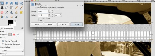
It’s not exactly the shape. I could refill the white, but since it is a single color filled area, I can use the scale tool to adjust size of this white box, so it spans the image
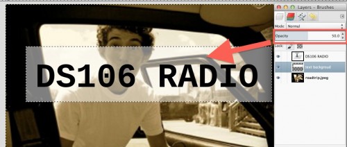
Now is where the extra magic comes in- that white background is ugly, but if I fiddle the opacity of the layer, I can get some nifty effects:
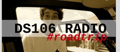
And now I might add the next layer, see if this red still works, a different style font though for a sub title
I can resize that backdrop white layer to better surround the image. But you know what, all of these new elements are really in the wrong place- I want to drop them a bit so I can better see the boys’s face. A nifty traick in GIMP (and Photoshop) is to click the group column in the layers palette:

And now I can move the three layers together using the move tool:
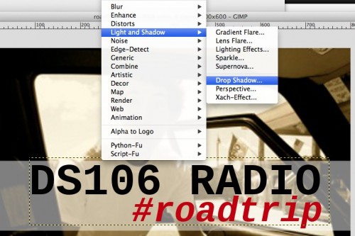
And it is looking good, but still the text is… flat. There are tons of things to explore under the filters menu… one thing is to add a drop shadow (and I usually drop the opacity lower then the default in the options box that appears)
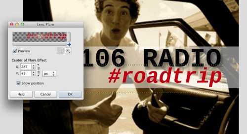
and I can also try something on the red text like a lens flare
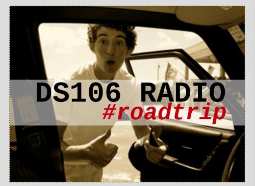
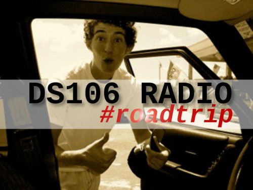
So here is something that has a bit more ooomph (I hope) or design to it that works with the image, not against it:
And you can argue that there are way better ways to do this. Ok. If you can, here, download my GIMP file and give it a go.
roadtrip.xcf (1.2 Mb GIMP file).
There are many ways to do design, but to really do it well, you have to it in layers, and you need to be thinking about how text can be more than just slapped in the screen.


Comments