I like how my students are learning how to create their ds106 design graphics in GIMP by no means the easist software to use. Sometimes they get frustrated and revert to ones they know or just drawing things on paper and taking a photo.
The point of this class is for students to become creators, and sometimes this means making a choice between trying some quick and easy web generator graphic tool or doing it the hard(er) way in software. To become a more versatile person with media, in the long run you will be better off knowing how to make your own graphics, because they will do much much more than the one off easy apps.
I saw this morning my student was up agains the GIMP wall
http://twitter.com/laurstray20/status/254954559825403904
Beyond not knowing exactly what the issue was, its not easy to explaining something like GIMP in twitter. And then I fund something that is wonderfully simple in Photoshop (adding an outline stroke to text) takes a few more steps in The GIMP. So I wanted to make sure I knew how to do this and try and explain it (late) to Lauren.
First, one thing I notice in this new version of GIMP that it did not list many fonts, On Mac OS X I found a video that helped (you have to identify your fonts folders in the app prefs).
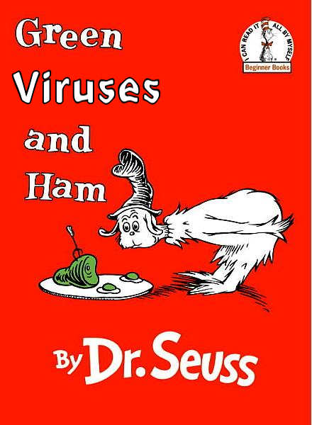
Okay, so Lauren’s design was to take a cover from Dr Seuss’s Green Eggs and Ham and replace the “Eggs” with Viruses– she got frustrated and went back to using MS Paint.
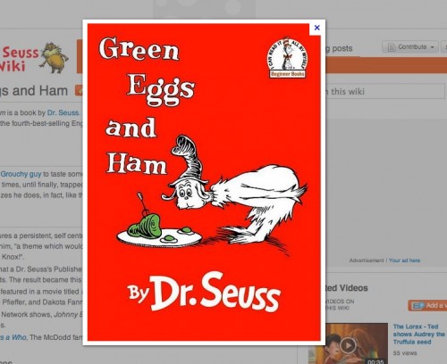
So let’s crack open The GIMP and see if we can walk through the process. First step is locating a base image, using google image search:
I just did a control click and copied the image. In GIMP it’s easy to create a new file with something on the clipboard:

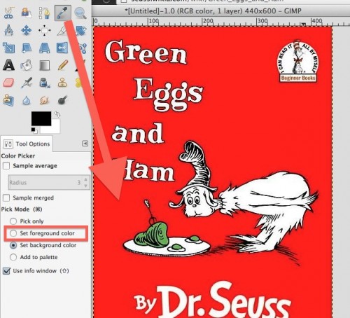
Then I use the eye drop tool to select the background ground so I have that ready to wipe out the “Eggs”
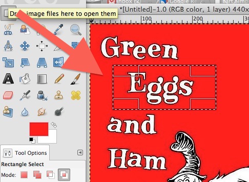
Now we can use the select tool to pick an area we want to fill:
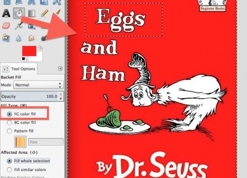
And we can use the bucket tool to fill this area (be sure to select the right option below the tool palette to use Foreground color.
Now we can start typing our new text. The text tool is s little trick. As you start typing in the box you can adjust its settings in the pane below the tools. Lie setting the font from the top left button, increasing the size, even increasing the letter spacing.
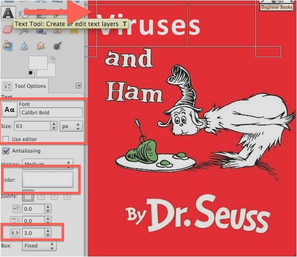
So we can fiddle and get the text close to what we need. But to match the style of the book cover, we really want to put a black outline on the text. This is a one click task in PhotoShop, but takes maybe 5 in GIMP. Essentially what we will do is to put a black layer behind it that is a few pixels bigger.
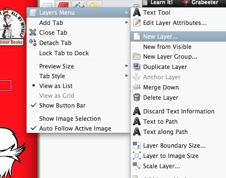
The first thing is to create a new layer we can put this outline shadow. From the top right corner of the layers menu, select Layers Menu -> New Layer.
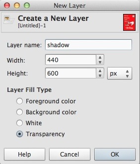
and give the layer a name:
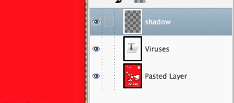
We want to click and slide this new layer from above our text:
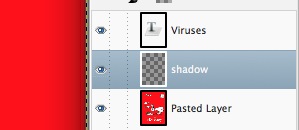
to below it
Now we come to the tricky part that took some research and experimentation to work out. What I am going to do is to make a selection area of the text in my words. So in that layer, if I select the text tool, then right.control click on the corner,I can get the menu that allows me to select Layer -> Text to Path
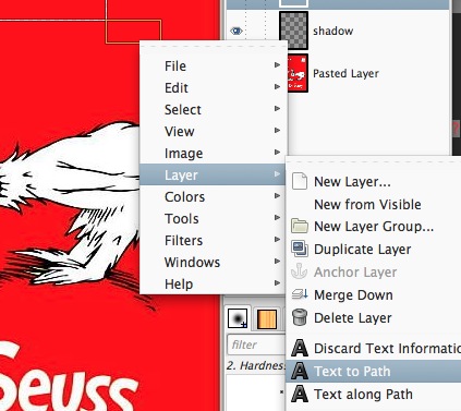
This along does nothing I can see, but if I go to the Select menu and then Text to Path, I should se thae “marching ants” of selection around my words:

Now we want to make sure we are working not in the layer with the text, but the one below it, our new layer, so click there in the layer palette. Next, before we do anything, we want to make the selection a little larger, so under the Select menu now we choose Grow, and enter “2” to make out selection 2 pixels larger in all directions.
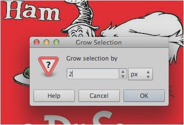
Now that we have this selection expanded, we can set our foreground color to black, and use the bucket tool to fill this selection. Because it is behind the white text, it now looks like it has a black border:
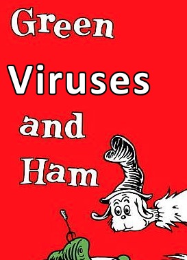
Now if we want to work with this, like move it around, we have two layers to content with. We can make them one, but click the tip later (our white text), and then using the small menu in the top right of the Layers palette, select layers, and Merge Down- this makes both layers into 1
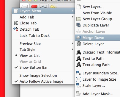
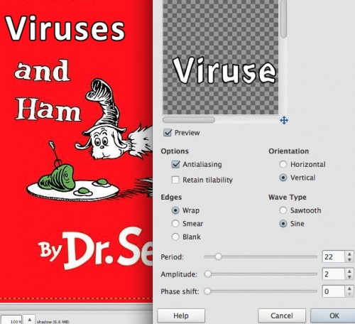
Not bad, eh? Now that they are in one piece we can use the Ripple effect to give it more of a look that matches the other words:
And voila!


Comments