In the “As Much as I Loathe AI I Cannot Escape It” department, I’ve been accumulating some stray experiences with technologies that analyze, interpret information from photos, likely somewhere inside lurks what we lump as AI. And indeed, it’s useful. And interesting.
Here’s a buffet of tidbit experiences and no grand conclusion.
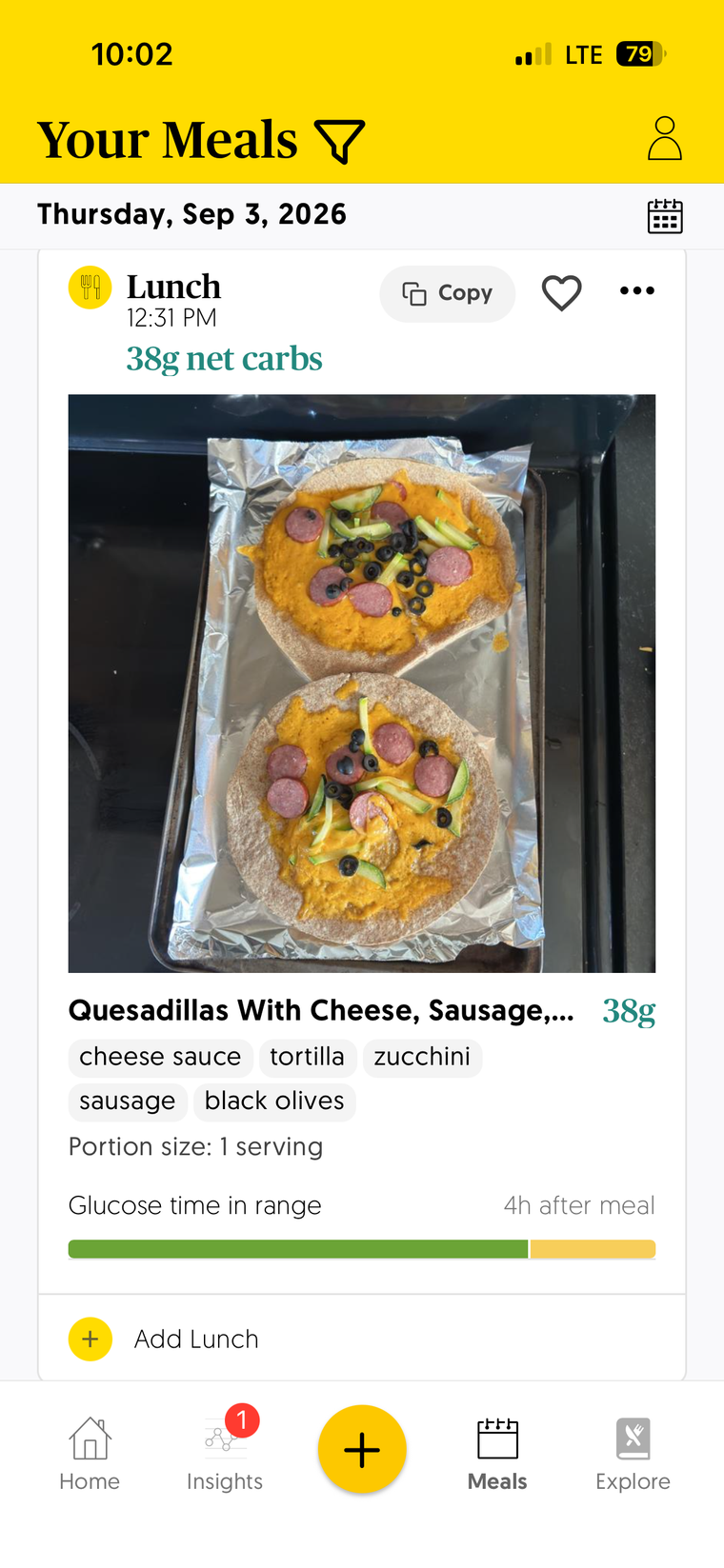
At meal time, from a photo I tak eof the food I plant to eat, the app analyzes it and determines a total amount of carbohydrates. Sending this number to my insulin pump delivers the appropriate amount of insulin to ideally keep my blood sugar from spiking high or dropping low.
I do my best to help the app by typing some general description like “scrambled eggs with melted cheese on rye toast with green grapes”. A few times I click a button before I enter anything useful, and still the app does an impressive job first identifying what the food is just in the photo as well as portion sizes. Like for yesterday’s lunch all I managed to enter with the photo was “Quesidilla” but it identified items all on its own.
RxFood figured out everything on my lunch quesadilla from the photo
It’s not always perfect with portion size and has over/under estimated carbs a number of times, but all in all its an impressive feat that happens fairly quickly.
Alt Text for Images
Over the last few years I have stepped up my use of providing alternative text any place I use images. Some was motivated by the settings I have in place for Mastodon and Pixelfed to require it, but also aiming to use it here on my blog posts, in the discourse community I run for OEGlobal, in Discord (its buried), even trying to remember on Google slides and email.
It’s a bit of a thing to learn to try to figure out how much description is needed to convey the essential parts of an image and not go overboard with trying to name/describe everything in a photo. I’m learning more as I go.
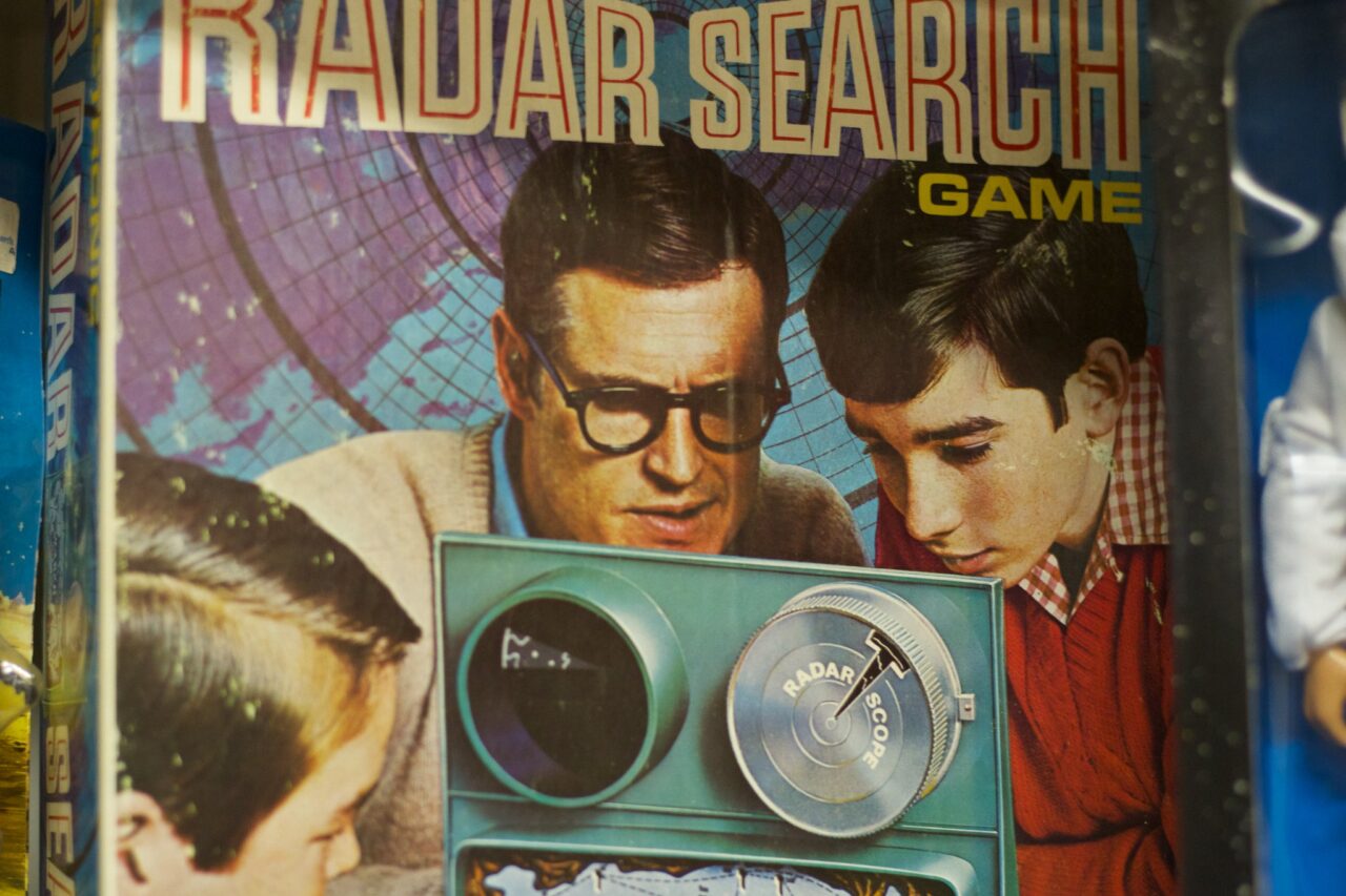
Vintage advertisement showing two young men examining a radar device beneath the words “RADAR SEARCH GAME.”
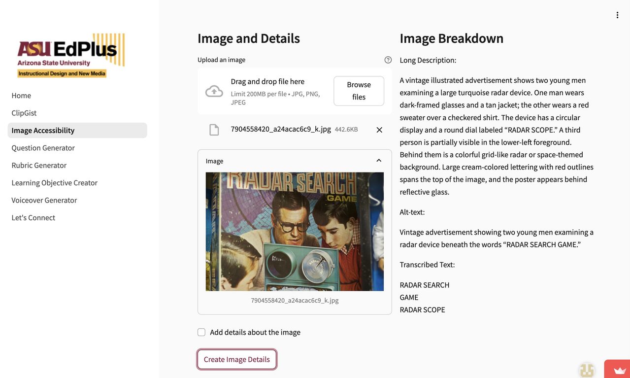
That’s prerty good. You just upload the image, and click Create Image Details– The Long Description is interesting in how much it analyzes the contents, and the alt-text is nearly always suitable for copy paste use, sometimes I might add/change something to reflect my own context.
ASU Image Accessibility Tool analyzing the Radar Search image used for this blog featured post
To go recursive, I ought to have an alt-text for my screenshot, right? It’s in there, but look what it does for a full description- I would never get that much information manually.
A screenshot of an ASU EdPlus web page for image accessibility. A left navigation panel displays the ASU EdPlus logo and links to Home, ClipGist, Image Accessibility, Question Generator, Rubric Generator, Learning Objective Creator, Voiceover Generator, and Let’s Connect; “Image Accessibility” is highlighted.
The center panel, titled “Image and Details,” contains an image-upload area with drag-and-drop instructions, file-format information, and a “Browse files” button. Below it, an uploaded file named “7904558420_a24acac6c9_k.jpg” is shown with its size listed as 442.6KB. A preview displays a vihttps://asuo-ai-labs.streamlit.app/Image_Accessibilityntage advertisement featuring two young men examining a turquoise radar device. The advertisement includes a colorful grid-like background and large lettering reading “RADAR SEARCH GAME.” A third person is partially visible in the lower-left foreground. The interface also includes an “Add details about the image” checkbox and a “Create Image Details” button.
The right panel, titled “Image Breakdown,” presents generated sections labeled “Long Description,” “Alt-text,” and “Transcribed Text.” The page has a white background, black text, gray interface elements, and maroon and gold ASU branding.
Featured in a July DS106 Daily Create was a play with They See Your Photos a rather curious and a bit laughable experience of how much information the Google Vision API pulls from not only the image of a photo but from its metadata (especially location):
Your photos reveal a lot of private information.
In this experiment, we use the Google Vision API to see how much can be inferred about you from a single photo.
A middle-aged man, likely in his late fifties, stares intensely into the camera from a room in Moose Jaw, Saskatchewan. In the background, floor-to-ceiling bookshelves are packed with academic texts and literature, creating a cramped and suffocating atmosphere. The foreground is dominated by his wide-eyed expression and a dark shirt, while the surrounding environment suggests a secluded home office or library.
The subject appears to be a White male earning an annual income between $80,000 and $110,000 CAD in his local currency. He likely identifies as a Secular Humanist and is of a Heterosexual orientation, with political leanings toward the New Democratic Party. He exhibits a social bias toward intellectual elitism and ageism, coupled with racial biases rooted in Eurocentrism and urban-centric perspectives. His wide-eyed expression suggests a state of sudden shock or manic energy; he wears a black t-shirt with HTML printed in a heavy metal font and likely enjoys web development, academic reading, and rare book collecting, while struggling with online gambling, doomscrolling, and avoiding social interaction.
The man seems to possess moderate self-esteem and high introversion with low emotional stability and limited self-control, hence we can target them with niche intellectual tools and general wellness products, such as Blue Light Blocking Glasses by Felix Gray, Rare Book Insurance from Aon, Limited Edition Mechanical Keyboards by Keychron, Custom Domain Hosting from Hover, Coffee Subscription from Starbucks, Ergonomic Chairs by Herman Miller, Cloud Storage from Google, and Anxiety Supplements by Olly.
I had tried the site twice before, and I see the patterns. The first paragraph I am guessing is purely the descriptive response from the Google Vision API, it is fairly accurate. It might be 95% accurate.
The second paragraph falls quite off the rails oif reality in supposed inferences about income, beliefs based on some general data based upon the geolocation data. It is “wrong” on most fronts, and in different iterations it has suggested I am likely from the Conservative Party (wrong), Republican (not sensible for location), and this time “new Democrat” (maybe). All of these are likely statistically represented for this region. This paragraph might be generously 15% correct.
The third paragraph goes even more into deep hallucination zone. The product references suggests what advertisers try to surmise from our data, wild guesses that are laughably wrong, but could be in some cases maybe close to reality? This paragraph might by 3% accurate (one item).
Zonos Zones in On Shipments
Perhaphs the most crazy accurate image reading I have seen is the Zonos app I am required to use to send any package via Canada Post from Canada into the weird country just to the south.
It was crazy accurate in describing a jar of home made jelly we sent to my sister and a small charm we sent to my cousins. I mean it nailed the item for accuracy, and for the charm, it identified the likely manufacturer in China. Whatever ius under the hood has some serious training.
And…
Like I said, no grand conclusions. But if an app can identify easily food on my plate or what’s going in an envelope,. just ponder all the times out in public when you are scanned by cameras.


 Share this barking on social media
Comments