I thought it was longer, but it was only a bit over a year ago I switched from my MovableTyle CogDogBlog over to its incarnation in WordPress. Having rolled out perhaps 5 or 6 other WP blogs I was thinking of blogging out my strategy for dealing with some of the coolest aspects of Wp, the flexibility of its templates.
Like many people, I stayed for a whole with the familiar default Kubrick template, the blue banner with curved corners that you still find all over the web. There are many similar variations, toss a different color in the banner, or a custom graphic. I began my tinkering by slowly customizing the sidebar before doing my own overhaul in November 2005.
There are likely a few different camps on how bloggers deal with the templates. Most folks likely just want to pluck something that looks nice in a preview off of a site like the WordPress Theme Browser, and consider the work done. This is great, the content magically transforms itself into what the template gives you. Move on to the content.
But if you are like me, and want to do some, to moderate, to severe customization, you get more and more into the code, and you look at templates a little bit differently. I have found that not all templates are created quite a like. Some are designed more as a one off, while others really lend themselves to being pried open. So I am going to try and blow the dust off of my braincells and try and outline the changes I have wrought in several WP sites, mostly for my own documentation sake.
The current CogDogBlog look and dog eared appearance:

was based on the Headspace Theme from Fernando Graphics:
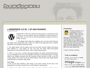
The tweaks involved some color changes, fitting in my own custom banner, blending the edges, changing the fonts, and most of the sidebar as been customized either in labels or content. I rarely stick with the sidebars that come with WP templates. You need to learn how to filter out what kind of page it is to have a different sidebar for a search result page than a category.
One thing I do on nearly every site is to alter the way search results and archives are generated. I still maintain that just about ever weblog software does archives wrong, because what they generate is an agglomeration of all the posts, which make them hard to browse. They way I do it is to have each archive entry or search result use a summary of the post, with the link to the full post. It makes the pages more readable and uniform– for my approach, see Archive Templaes as Summaries.
The MCLI iForum is a publication presented via blog software — it is not in reverse chronological order, but uses a static page plugin for control the front page layout. The design of the iForum:

is based on the Technology Bytes theme (no longer on its original site, but it can be found in the WordPress Theme Browser):

The look was chosen based on having a fairly wide layout (many blog templates are way narrow, especially when there is a side bar), a clean layout with a top wide banner, and colors close to the official blues we needed. This one called on my most wild and crazy WordPress tweaks, using a set of Custom Fields, links collections, categories, and some extra plug-ins to get it to the current form (see details on behind the scenes tech on this blog).
For my personal I Hate Running Blog:

was a natural with its Polaroid motif from the Travelogue Theme:

I stepped into new territory by splitting the top banner and coding it so random photos popped on the left, and using a flickr creative commons photo used for the shoes background. I again used custom fields and values to control the main content display, and added some new small templates for content on the sidebar that are read by PHP include statements. I wrote up a more than usual detailed set of web site notes.
My most recent creation is the site for the NMC Second Life Campus project:

based on the Blix theme found on the main WordPress site:

It is here I finally sorted out that my theme shopping is no longer on what the sites look like in preview or the pretty flower in the header graphic, and is more based on the shape, structure, arrangement of a a preview. In this one, I changed the background to use a gradient theme (swiped from another template), I knocked extra space of of the top, I altered the orange color to match our logo, rigged a completely different sidebar structure. I had to add some better styles for blockquotes. I added a simple banner rotation using the Image Banner Rotator.
But I am extremely impressed with the how structure of the Blix template… which is why it likely sits on the WordPress site. The style sheet does a separation that makes a lot of sense– it is really simple main sheet that splits the styles into two forks:
@import "layout.css";
@import "spring_flavour.css";
The layout.css styles define all the positioning and layout specs (duh) and the other one adds the colors and image backgrounds. This would make it easier to create a new variation with a different color appearance, because the visual appearance is separated form the structural.
The other things I need to add is a print style sheet, again something you almost never find in themes, but make it much more printer friendly when someone clicks command-P
So a theme philosophy hinges on your interest/knowlegde of CSS, PHP, and the WP structure, and more so, on whether you really need to bend and shape WordPress to do some specific tasks, or if you can just let it do what it does out of the box. Once you start tinkering though, it makes a switch a bit more hairy especially if you have altered the template files.
I still consider myself more of a template tinker-er, so I will likely always start with an existing template that is “close enough” to what I have in mind.
Of course, now that I have a fair command of WordPress, I am already getting tremors as an upcoming major web site development is looking more and more like a job for Drupal… part of a strategy I have done over an dover- follow the lead of clever folks like D’Arcy….

CogDog, you’ve outdone yourself this time. What a lucid and helpful master class this is! As soon as we get past Faculty Academy, I’m going to be doing some serious tinkering on the ol’ GW site.
This is very seriously cool stuff. Thanks a bunch!
Good Dog! You inspired me to dump some spaghetti-code themes and get back to sanity. Thank you, thank you, thank you. jay