Tony Hirst, absolutely one of the best last of the Bloghicans, wrote the other day of Keeping Up With What’s Possible – Daily Satellite Imagery from AWS. This struck a memory nerve, as this is what I did in the late 1980s for my Masters Thesis in Geology… though it was stone and chisel computing days.
What Tony is speculating about is the potential of a huge, freely accessible collection of earth imagery, updated regularly, all from the Amazon cloud.
For research, I’m guessing we’ve gone from a state 20 years ago – no data available – to 10 years ago – available under license, with a delay and perhaps as periodics snapshots – to now – daily availability. How does this impact on research, and what sorts of research are possible? And how well suited are legacy workflows and tools to supporting work that can make use of daily updated datasets?
I can go a bit farther back, to 1987, when I was a Masters in Geology student at Arizona State University. My advisor, Dr Michael Sheridan, had done the seminal mapping of interpretation of the Long Valley caldera, formed from major volcanic eruption that produced the Bishop Tuff about 700,000 years ago, named for the nearby town of Bishop California (ironically, I drove right past my old field area about a week ago_.
Mike had a project offered to me to evaluate the area using remote sensing data from Landsat 7 satellite Thematic Mapper (TM) data. Back then, Tony, the data was not in a cloud, but on magnetic tape that I loaded into a mainframe VAX computer in the basement of the ASU Geology building. I’m away from my printed thesis:

2009/365/217 Stratigraphy of My Geologic Past flickr photo by cogdogblog shared under a Creative Commons (BY) license
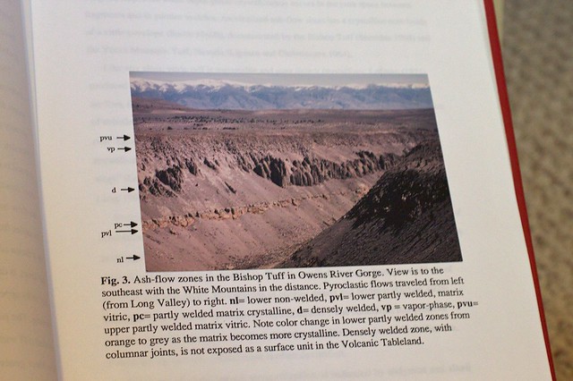
And the files I still have on my computer are in irretrievable MS Word 4 format, so I am vague on the methods used. But I did create this false color image used then to ground truth as well as analysing the variations in reflected infrared wavelength data, correlated with spectral data from my collected examples.

This was how I published in the late 1980s, that’s a 35mm print photograph glued into my Word layout with labels in the right place:
Old School Publishing flickr photo by cogdogblog shared under a Creative Commons (BY) license
And my graphics done by compositing Excel generated graphics using MacPaint:
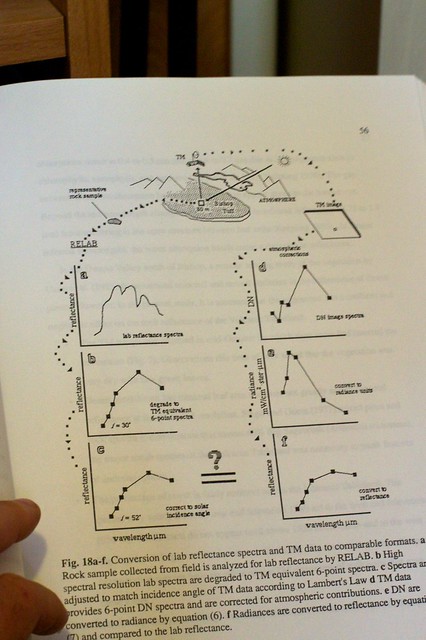
Detailed Graphics flickr photo by cogdogblog shared under a Creative Commons (BY) license
I curious to see what I could do now using the info provided in the AWS Landsat reference Tony linked. I used MapBox just to get a view of the area:
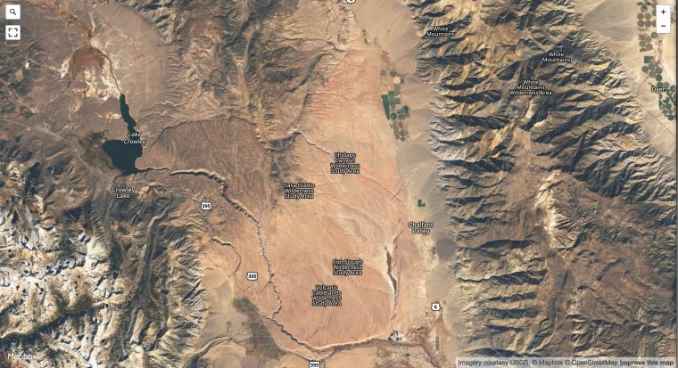
You can browse the earth from current Landsat data via MapBox
You cannot do much with it.
I had better luck playing around with the EOS Landviewer where you can load different scenes, from different times, use different wavelengths bands, and likely a bit more I could not quite figure out.
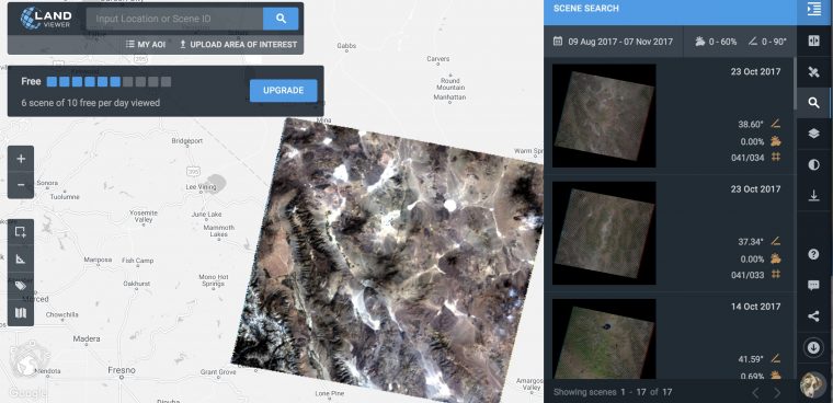
The EOS Landviewer view of my old field area. I can see all the landmarks I knew well.
But you can only download low-res images, which are banded as I zoom in on the Volcanic Tableland north of Bishop:

But I could tell from the file name L7-LE07_L1TP_042034_20170811_20170906_01_T1_B5-B2-B1 that it provided all the data the AWS reference listed to find the raw data — It’s Landsat 7, and Path 42, row 34. I downloaded the 12 MB Full scene CSV list, and searched for 042034, finding in the data the URL for the image data.
(I’m already deeper in that I should bother for what I need to get done today, but once this can is opened…) I could see in the directory the TIF files for bands 1,2, and 5– the ones in my 1980s image. Each was about 60Mb. But how to composite them? Reach for the Google on photoshop composite red blue green data layers and I found a NASA post on How To Make a True-Color Landsat 8 Image which showed me how to import the files as channels, and merge them.
As raw data channels converted to RGB channels, it’s not quite exciting:
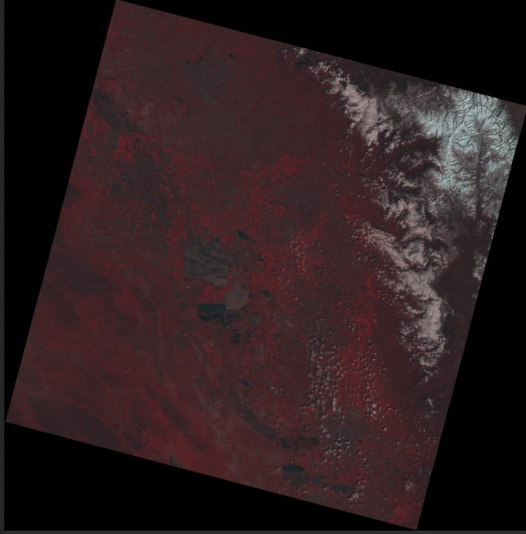
Merged channels of Landsat 8 channels 1,2, and 5
I could not quite match the transformations I did earlier, this as about the best I could do and not lose a few more hours.

A Landsat image composition I made sitting at my breakfast table
Still, to think of how much data is really available here, yes, with some gymnastics, but its open and freely available. That VAX tape I used had to be purchased through a grant (no idea what it cost) and was rather unwieldy to work with (I recall printing out matrixes of pixel values).
Maybe the highlight of this work was a little later seeing a similar character to myself in a Mary Worth comic:
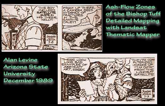
Mary Worth Knew About My MS Thesis flickr photo by cogdogblog shared into the public domain using Creative Commons Public Domain Dedication (CC0)
“The boy included satellite maps in his thesis, Kelly.”
“From up there the satellite sees evidence of fractures in the Earth’s crust.”
“These look like bad examples of abstract art, Essex!”
“They are computerized images of ‘TM Data’ from the Landsat Satellite”
Art did imitate life! And, Kelly, yes I am still producing bad examples of abstract art. You?