A core of the ethos from my years participating and teaching ds106 is the importance of not only creating media, but sharing the behind the scenes “how”.
Typically the idea of doing a DS106 Daily Create or an Daily Digital Extend is to do it quickly. One aspect I always enjoy about the daily _____ concept is the various ways people find to achieve a response.
So a bit of unmasking here, just for the sake of it.
The Ontario Daily Extend #oext215 Redo a Public Domain Cutup was one I have used before in other sites.
The @PDCutup account is a bit that every four hours tweets a mashup of public domain images from two institutions in New York City- one from the New York Public Library and one from the Metropolitan Museum of Art
NYPL: The Elmsford, Broadway, 181st Street ..https://t.co/XfQeIUfbJT
MET: City Hall Park, Broadway, from Park P..https://t.co/GSckgcvQi6 pic.twitter.com/Cm6y6gXCcc— Public Domain Cut-Up (@PDCutup) June 19, 2018
Each tweet includes links to both source images. Your mission, show you choose to extend it, is to use the same images in some other way together to make a new cutup.
I just love the idea of @PDcutup and not only because it pulls from collection of open licensed art. The concept behind it is brilliant, it’s all dne by a bot created by Matt Miller, read more at Public Domain Cut-up Bot, inspired by New York City billboards where often you can see through rips and tears in the top image to see parts of the previous board.
The result is a Twitter bot that slices through the layers of public domain images creating new confusing and often interesting combinations. The bot works by pairing up two works starting with the metadata released by NYPL and MET. It looks through all the titles and finds one from each that have the smallest levenshtein distance or the fewest changes needed to make the two titles the same.
….
The bot then layers the two images together and takes a digital X-ACTO knife to it, cutting an irregular polygon into it with only a pseudorandom number generator guiding its hand.
It also has another trick it sometimes employees. It can find the most common color in the upper layer and slice out those pixels exposing the underdrawing which has a much more “all over” glitchy effect. The result is a new image, an aggregation of two works that often span decades and cut across artistic styles and mediums.
It’s rather amazing how the bot finds similar images from 2 different art collections. And I love how it’s tweets includes the links to the source image.
So the challenge for this Daily was to create a different kind of remix image from the same two ones used in an @PDCutup tweet.
From the people who tried this Daily, I’m not sure what Irene used to create her image, which was two images with a “golden” theme in the title
@OntarioExtend #oext215 Remixing @PDCutup from June 22
NYPL: Golden Gate, Jerusalemhttps://t.co/OubhSQxpqW
MET: Jerusalem the Goldenhttps://t.co/VAt376g7Xa pic.twitter.com/4ADspd748L— Irene Stewart (@IrenequStewart) June 26, 2018
Lynn’s remix was of two nautical scenes, but she shared a free. web based remix tool, that as new to me
https://twitter.com/LynnCartan/status/1011649307274108928
Greg created his with Keynote on an iPad
#oext215 @ontarioextend Remix June 18
NYPL: Plymouth Rock and Harbor from Cole's..https://t.co/unzpSmkjaQ
MET: Bay and Harbor from near Fort Castle..https://t.co/GdKMwVYURj pic.twitter.com/h2AKu1mjCf
(Used Keynote on iPad instant alpha to mix in MET photo) https://t.co/blPMsEppkV pic.twitter.com/bwX7na6l3D— Greg Rodrigo (@greg_rodrigo) June 26, 2018
Steven used pixlr, one of my favorite web based graphic tools
#oext215 @ontarioextend The Flying Fish of Fronville from the June 25 mashup. Used @Pixlr Editor (https://t.co/ydUzM00Gxu) to put them together.
— Steven Secord (@stevensecord) June 27, 2018
but later was inspired by Lynn to redo it using the Freemix tool she recommended
Definitely echoing @cogdog. Thanks for telling us about Freemix. Had so much fun I redid #oext215 using it. Very fun! pic.twitter.com/cnZ4cGoTIW
— Steven Secord (@stevensecord) June 27, 2018
This is a lovely circle of creative effort, where I’d like to think people are driven by interest and creativity, and not just checking an assignment box. And in a tweet, people are not just posting their media, but sharing their tools and giving attribution to the sources. Well done, Extenders!
I’m publishing the dailies but also trying to be in the mix too, so here was my contribution
@ontarioextend #oext215 Best seat at the Grotto room is near the Subterranean Roundhouse Dancers. Alt version of @PDCutup https://t.co/irDDuQdM5J
NYPL: Grottos, Caverns, Grunewald Hotel https://t.co/0ePWx240s3
MET: Dance in a Subterranean Roundhouse https://t.co/ZVDV4ZIXxz pic.twitter.com/hDZmNlex8Y— Alan Levine (@cogdog) June 26, 2018
I liked the similarity in themes of dark ballrooms from the two original images:

Grottos, Caverns, Grunewald Hotel, New Orleans, La. public domain image from the New York Public Library
My go to here is Photoshop, software I am still learning after first trying it in 1993 😉 But my remix game definitely went up notches a few years ago when I started using alpha masks in my Photoshop editing.
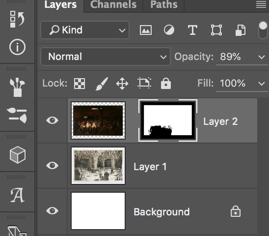
It’s power is you can composite images without destroying the originals. You use a “mask” layer, where what is painted white in the mask you can see, and what is black as masked. So you can fine tune edges, selections by painting in the mask layer.
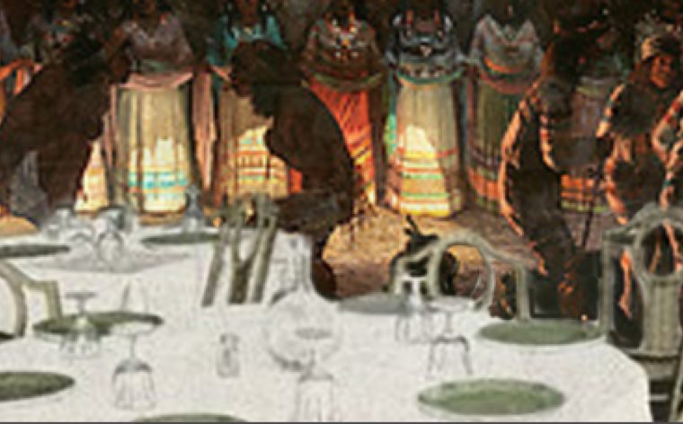
I started by loading the Grotto image in Photoshop and just trying to think what kind of way I might use it with the darker image of the dancers. The idea that entered was making that front table like a prime spot to see the dancers, so I used the magnetic lasso selection tool to get close to selecting around the table, and tops of chairs. When using masks, the selection need not be perfect, as you can adjust later in the mask layer.

Selecting the front table
I added to the selection the white border. With that selection active, I went to the Grotto image in another window, did a quick copy, and returned. Here is where I use a nifty tool, under Edit, Edit Special I select Paste Outside. What this does is create a mask of everything I selected, so I get an image where the table is still visible, but behind it you see the dancers.

Using Paste Special to put the dancers image outside of my selection
The image I pasted in now has an alpha layer mask (the black and white to the right)

If I select the alpha mask, I can zoom in and paint with a small brush more black so I can mask the dancer layer and see through to the Grotto on, like the gaps in the chairs, and slop around the edges of my original selection. When I zoom in I can see how well they sit together:

The I can even command-click the alpha layer to load it as a selection, go to a new layer, and fill it with a color (just to demo this)- this shows how I can put stuff behind the table:

How the mask provides a selection that appears behind the table
Discard that pink layer!
Just to make it look less pasted together, I return to the dancers layer, and drop the opacity to maybe 80% so you can see through it slightly, and here is my final composite:

This all took maybe 20 minutes, and the blog post to try and explain it 3 times as long!
Masks and adjustment layers and such sound like mumbo jumbo, but if you want to create photo realistic mashups, they are rather essential in my book for my graphic work. I use them all the time.
That’s the behind the scenes look at my Daily Extend.
Featured Image: Unmask Me (Me) Sketchport image by Don’t Speak Silent licensed under a Creative Commons CC-BY license. This may be the first time using an image from this site, but they should be commended for not only explicitly licensing images but also giving credit to the person who made it, unlike other scammy image scraper sites.


