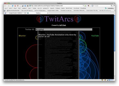
Here’s another interesting tool for visualizing relationships in twitter, Jeff Clark’s TwitArcs:
I’ve combined some visuals from a side project related to linguistics with twitter data to create TwitArcs. It takes the latest 100 tweets for a twitter ID or term of interest and creates a list representation that has arcs connecting messages sent to the same users or that use the same primary term. You can click on the left side to load the tweets for a new user, on the right side to load the tweets for a specific term, and in the middle to visit the actual tweet.
Sure enough red arcs on length show people I “converse” with meaning the people who I tweet at or who tweet back my way, and blue arcs on right connect conversations by common words. You explore these arcs by moving the mouse down the page to hover over your old tweets.
The visualization is well done, eh?
But the way twitter has been coughing up major fur balls (or not even registering a pulse) lately, has me thinking future visualizations may arc more like:


