On a long distance driving trip this week I’m getting a good chunk podcast listening time. One of my favorite ones is Song Exploder:
Song Exploder is a podcast where musicians take apart their songs, and piece by piece, tell the story of how they were made. Each episode is produced and edited by host and creator Hrishikesh Hirway in Los Angeles. Using the isolated, individual tracks from a recording, Hrishikesh asks artists to delve into the specific decisions that went into creating their work.
I’ve blogged before how I thought of extending this idea into the kind of blogging we are asking participants in Ontario Extend to do. My rewrite of the Song Exploder was:
My blog is a place where I take apart my ideas, and piece by piece, tell the story of how they were made. Each episode is produced and edited by host and creator aka me, wherever I am. Using the jumbled, thought tracks that keep me awake at night, I ask myself to delve into the specific decisions that went into creating my work. I barely edit them, and not frequently enough checking for typos, but condensing the story to be tightly focused on how bring my ideas to life.
While driving today I thought of going one more notch with this, and creating it as something to add to the Ontario Extend Activity Bank as “Class Exploder“:
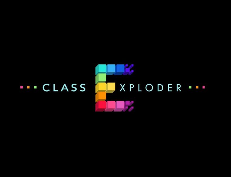
A parody recast of the Song Exploder meant only for parody and educational use, don’t sue me, ok?
Class Exploder is an Ontario Extend activity where teachers take apart a single class plan, and piece by piece, tell the story of how it was made. Each blog post is produced and edited by a teacher who produced the materials. Using their notes, memory, influences, this activity asks teachers to delve into the specific decisions that went into creating a class plan.
Before I add this to the Activity Bank, I need an example, so I am choosing from my recent Networked Narratives class the one for Week 11.0: The Game Board of Digital Redlining.
This is a class I taught Spring 2018 for a class at Kean University; the unusual structure of the class was that the students were in a classroom in New Jersey while I taught by developing materials on a course web site and appearing in class via Google Hangout.
This was for part of the course where we had already investigated principles of games and explored a collection of classic computer games as well as empathy games. It’s important to know that for the entire course I have been weaving a theme of asking students to question what it meant to have a Digital Life.
I wanted to do something that was not just about games themselves, but how gaming principles might be used to look at things outside of games. I had a seed of an idea earlier in the semester, that meant reaching out to Chris Gilliard for his work on digital redlining.
Redlining was a practice started with National Housing Act of 1934, where the Home Owners Loan Corporation (HOLC) produced maps for cities that “color-coded the areas where loans would be differentially available. The difference among these areas was race.”
Chris has defined a current form of redlining not for housing, but for digital information and services:
“Digital Redlining is a different thing: the creation and maintenance of technological policies, practices, and investment decisions that enforce class boundaries and discriminate against specific groups. The digital divide is a noun; it is the consequence of many forces. In contrast, digital redlining is a verb, the “doing” of difference, a “doing” whose consequences reinforce existing class structures. The digital divide is a lack—redlining is an act. In one era, redlining created differences in physical access to schools, libraries, and home ownership. Now, the task is to recognize how digital redlining is integrated into technologies, and especially education technologies, to produce the same kinds of discriminatory results. The divide is a “lack” — redlining is an act.”
The idea that bounced around my head was– could the concept of digital redlining be somehow investigated as somewhat having game mechanics, not that it was a game at all, nor for entertainment, but was situation where those in power created a set of rules that citizen players had to navigate.
At the same time, one of the Kean Writing Studies graduate students I was advising was researching and writing a young adult novel about an inner city Newark teen was suddenly forced to live with a father she did not know who lived in the affluent area of Milburn. Ironically, I have visited friends who live in Milburn, but I also was aware that these two vastly different socioeconomic communities were not very far apart geographically.
Since Chris’s digital redlining work was focused much on his home city of Detroit, I was thinking my students might be able to investigate how things were in Newark, New Jersey.
I was not really sure if this was reasonable, but I reached out to Chris by twitter DM with the idea, and he was willing to join me in a Google video chat in late February.
In that conversation we landed on the idea of maps, the original redlining maps and the maps that showed differential distribution of digital services might be considered a “game board”.
Chris rattled of a few possibilities of the kinds of digital services my students could look at and subsequently he tweeted me even more examples.
https://twitter.com/hypervisible/status/968311315243581440
We started co-editing a Google Doc for brainstorming. I felt like the hardest thing to do would be finding the kind of data showing digital services distribution in the Newark area.
The idea that tied it together came again from thinking about maps. For the Mural UDG project I was part of in March, we had introduced faculty to the H5P suite of interactive web widget building tools— the light bulb that went off was asking students to use the juxtapose tool to superimpose a map of modern digital services atop the historic digital redlining map of Newark.
I mocked up a demo to share with Chris:
The trick in doing this is getting maps to be aligned. I provided a “base map” of the 1939 Redlining Map of Essex County NJ from the Mapping Inequality project

Knowing the students did not all have access to graphics tools like Photoshop, I tested in the ability of the web based editor pixlr. By putting the base map in pixlr as a layer, importing a modern map of digital services, setting the opacity of the later so the base layer could be seen, a student could resize that map to align commons geographic features like the two rivers that run through the city.
I knew this part would be complicated, so I made a screen cast demo:
and the entire activity was written up as a “Make” in the NetNarr Make Bank (a site similar to the Ontario Extend Activity Bank).
That was the activity part, but there was more to this class that needed to be in place. I start my classes with an “opener” meant to generate some discussion, so we first watched a short video about the history of redlining as well as a part of a talk Chris gave about digital redlining.
I then asked students to spend some time researching digital redlining on their own using the following as starting points:
- Digital Redlining, Access, and Privacy (Common Sense Education) https://www.commonsense.org/education/privacy/blog/digital-redlining-access-privacy
- Digital Redlining and Privacy (Teaching in Higher Education podtcas) http://teachinginhighered.com/podcast/digital-redlining-privacy/
- Mapping Inequality (University of Richmond) https://dsl.richmond.edu/panorama/redlining/
- Mapping Incomes: “Income disparities are real—and getting more extreme. A close look at maps of income distribution in U.S. cities reveals subtleties and surprises” (ESRI)
https://storymaps.esri.com/stories/2018/mapping-incomes/index.html
My real hope in working with Chris was that possibly some of his students could explain digital redlining to mine; I really like classes where we can get students talking to other students. But the timing did not work out for this, but Chris was kind enough to record a video challenge to my students
I provided my students a starting list of sources they might use to create maps of digital redlining in the Newark area:
- Uber wait times — is there other data for ride sharing services you can find https://www.washingtonpost.com/news/wonk/wp/2016/03/10/uber-seems-to-offer-better-service-in-areas-with-more-white-people-that-raises-some-tough-questions/
- Transit maps e.g. https://www.panynj.gov/path/maps.html
- Amazon delivery https://www.bloomberg.com/graphics/2016-amazon-same-day/
- Pokemon Go https://www.pokemap.net/united_states_of_america/newark
- Census data http://censusviewer.com/city/NJ/Newark
- Google maps for locations of stores, business offering technical services, or coffee shops (?)
- Population data http://www.arcgis.com/home/webmap/viewer.html?services=302d4e6025ef41fa8d3525b7fc31963a
- Social media check-ins, act e.g. https://ny.curbed.com/2017/1/18/14309678/nyc-subway-map-instagram-hashtags or Snap Maps (public snapchat activity by location)
- Broadband services https://broadbandmap.fcc.gov
- Cell phone towers http://www.cellreception.com/towers/towers.php?city=newark&state_abr=nj
- Stingray surveillance https://www.aclu.org/issues/privacy-technology/surveillance-technologies/stingray-tracking-devices-whos-got-them
- License plate readers http://www.photoenforced.com/license-plate-reader-cameras.html
- Predictive policing “heat maps” http://www.riskterrainmodeling.com/
- Other ideas?
My classes meet once a week for 3 hours, and this left the second half of class as time for the students to try and complete the “make” for creating a digital redlining “game map”.
Their prompt for their weekly reflective blog post included:
Include reflections on what you learned about redlining / digital redlining. How could people affected better understand it? As we discussed in class, while it is not a game at all in terms of being entertaining, can you identify in any ways the mechanics, process might thought of as having elements of games?
Share a link to the Make Bank response to Digital Redlining: The Newark Game Board including the H5P image juxtasposition content you created. How might this be like a game board? Does it really indicate digital redlining? What would it take to do so?
Because of the way these “banks” work, the Make for Digital Redlining: The Newark Game Board includes the student responses.
You can see the final class plan for this at http://netnarr.arganee.world/week-11-0/.
I was impressed that all the students managed to get through the several steps and tools to produce their comparison “game maps” but also at the in class discussion and followup blog posts how this unit gave them insight into a social issue they had not considered before.
Featured Image: I made a mashup of the way Song Exploder blogs their episodes with the graphic I had created for the Week 11 plan– the latter was a composite of the Essex County Redlining map from the Mapping Inequality Project licensed Creative Commons Attribution-NonCommercial-ShareAlike 4.0 International License superimposed on Game, board (AM 1967.16-1) Wikimedia Commons image by Auckland War Memorial Museum licensed under Creative Commons CC BY Attribution license.